A new year brings the chance for change, and nothing makes a fresh start quite like a new coat of paint. Kate here, and this January I began making some positive changes to improve my home. From painting my cabinets in the laundry room to adding a palette of silver and gold in my dining room, the changes have been a long time coming. Are you planning a makeover for your living room, bedroom or bathroom? Here’s something that might help–a collection of 5 cool paint colors for 2014!
A few of the color suggestions in today’s post are Pantone’s 2014 picks for the home. One is an up and coming shade that’s increasingly appearing in the spotlight. Another is one of my top picks, selected for its warm, refreshing nature and its ability to complement other popular hues. Before you head to your local home improvement store to stock up on paint chips for ideas, consider these intriguing colors…


Deep Mint
The first featured color is a gorgeous shade I like to call “deep mint.” Pantone refers to the color as “Hemlock.” Deep mint is powerful yet soothing. A bit richer than the icy mint hue often seen in retro kitchens, this shade can even have an elegant feel, especially when combined with other decadent colors such as violet. [from Jill Sorensen]

Deep mint can also be ideal for accents, as shown by the painted trim in the room below… [from CB2]

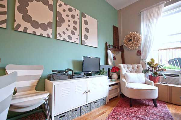
Deep mint and gray make a great duo for modern spaces, and the result is quite refreshing! [from Chris A. Dorsey Photography via Houzz]

The color is also rejuvenating and crisp, especially when combined with white. The clean look that results from this duo is perfect for powder rooms. The space below features mint tile rather than painted walls, but the overall effect is the same… [from murff BADA, LLC]

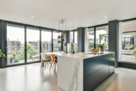
Charcoal Gray
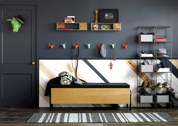
We now move to a dark yet elegant shade known as charcoal gray. Charcoal ranges from deep gray to almost black. The effect of this hue is dramatic and rich, which is intriguing, given that many would consider this color a neutral. Note how bright hues such as orange and green pop against charcoal walls. [from CB2]

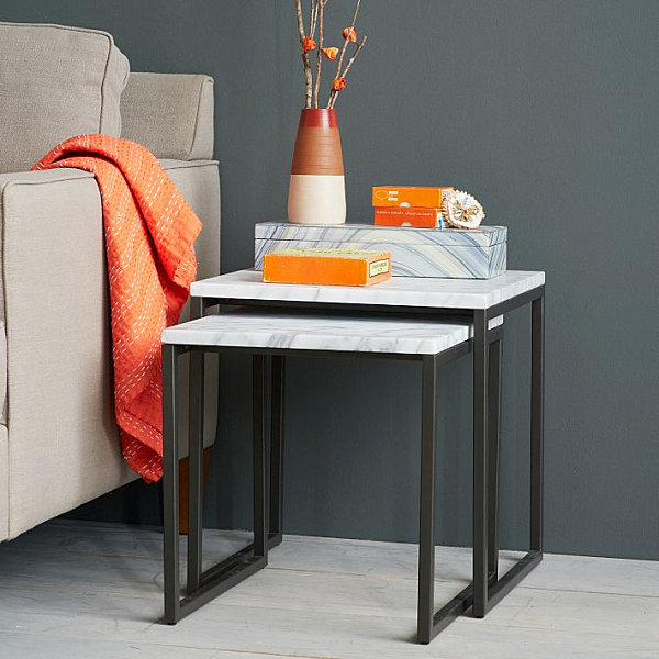
Speaking of orange, below we see this fiery color come to life against a charcoal gray wall. Also note the way marble and agate-motif surfaces become extra elegant when placed against a charcoal backdrop. [from West Elm]

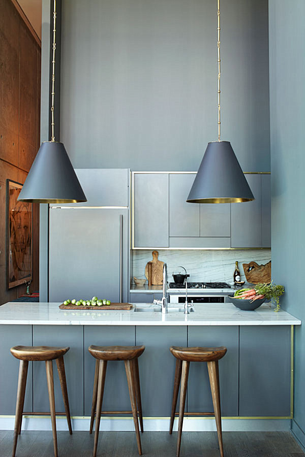
Who says you can’t mix silver and gold?! Warm and cool tones create a design-savvy blend that has exploded in the design realm. Another reason to love charcoal: it provides the perfect setting for a combination of metallic tones. The contrast is striking, as shown by the charcoal wall, gold pillow, warm wooden tones and metallic detailing in the next featured space… [from West Elm]

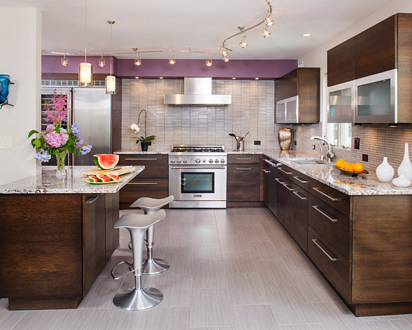
The kitchen of designer and blogger Athena Calderone showcases the perfect blend of light charcoal, brassy details and marble. An unexpected combo with a decadent look… [from Camille Styles]

Lemon Yellow
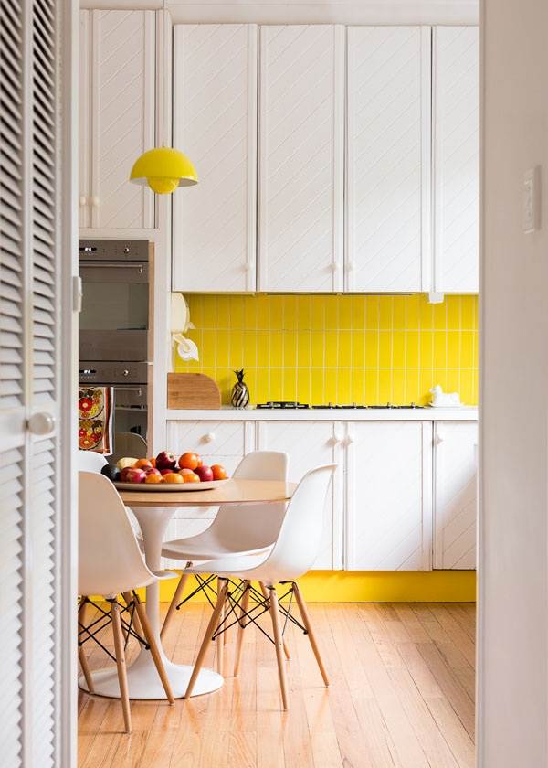
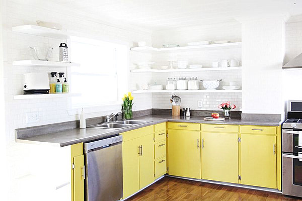
The next hot paint color on today’s list is a sunny one. Say hello to lemon yellow! This vibrant color is increasingly appearing in rooms such as kitchens and bathrooms. The perfect complement to crisp white, it’s a visually stimulating choice for waking up an otherwise stark room. [from Old Brand New via A Beautiful Mess]

When the talented bloggers at A Beautiful Mess successfully completed a stunning kitchen makeover, our favorite feature of the new space was the vivid yellow painted cabinets. Modern and positively radiant, don’t you think?!…

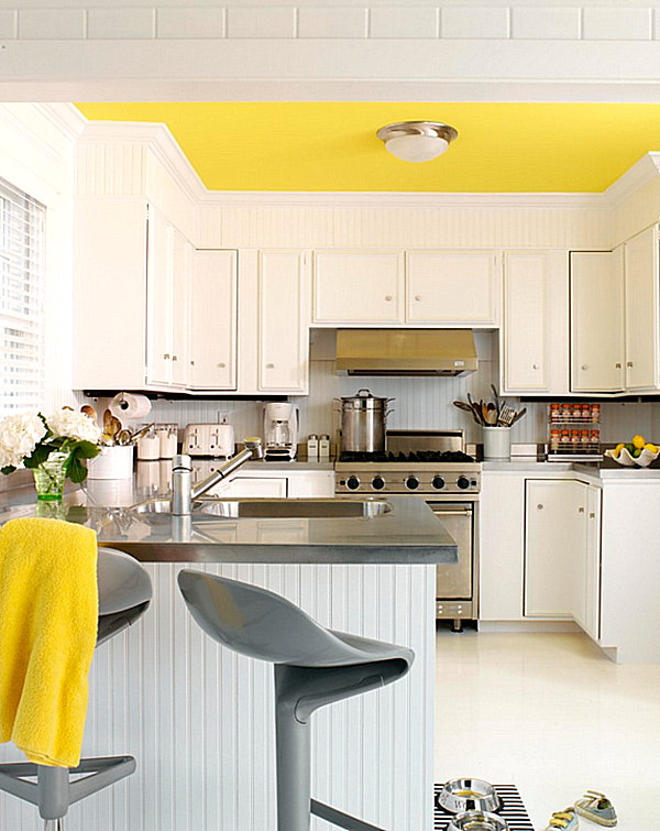
Don’t underestimate the power of lemon yellow in an unexpected location, such as the ceiling… [from Tara Seawright]

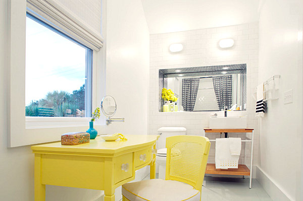
The way yellow brightens an all-white room makes it an ideal choice for bathrooms, especially when the walls are white and the space is screaming for a wake-up call! [from Rethink Design Studio]

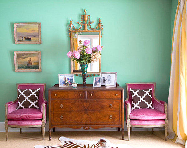
Raisin
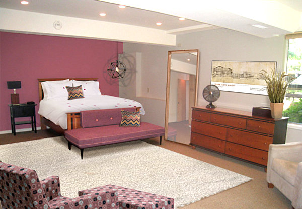
Next up: raisin. An unusual color that can ranges from rosy brown to earthy purple, this hue will make you take a second look. While this unexpected shade is hardly common, it’s ideal for spaces that seek to establish a decadent vibe, such as the living room or the bedroom. [from Reinvented Interiors via Houzz]

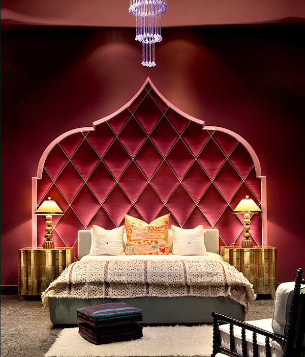
The space above veers into purple territory with a shade similar to Pantone’s “Rose Brown,” while the space below takes on an almost maroon feel (much like Pantone’s “Rhubarb”). Isn’t this raisin bedroom ultra luxe?! [from Gordon Stein Design]

Raisin meets rose in this next bedroom from Mochi Home. Note the Mid-Century modern vibe. Yes, folks–raisin can even go retro!

While the accent trim in kitchen below is hardly raisin, it reminds us not to overlook a slightly different shade in the purple family–“Radiant Orchid,” Pantone’s Color of the Year for 2014! [from Creative Design Construction]

Dusty Peach
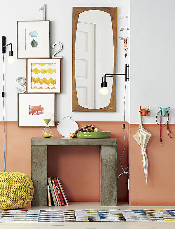
We end with a color that has been heavily showcased in images from the renowned modern retailer CB2–a shade I like to call dusty peach. This inviting hue beautifully complements deep mint and raisin, two other unusual, unique colors from today’s post. Plus, it’s a serene version of orange, making it subtly powerful. Note how well this hue pairs with shades of blue and green…

Speaking of green, dusty peach blends beautifully with lime green, creating a beachy feel. Why shouldn’t your space remind you of a tropical vacation? [from CB2]

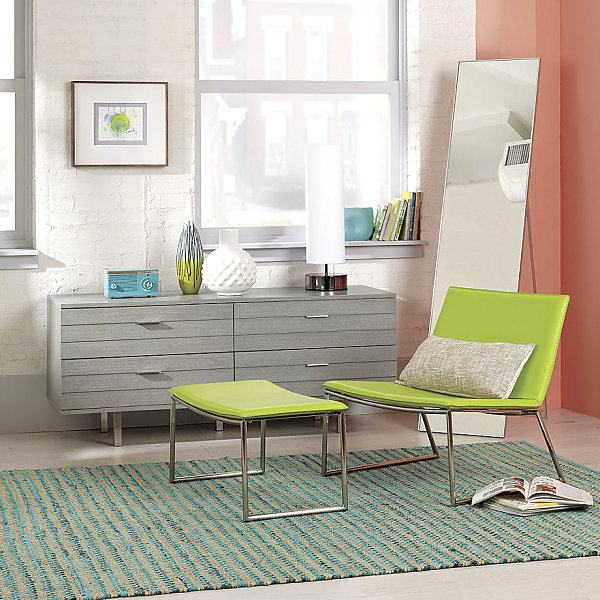
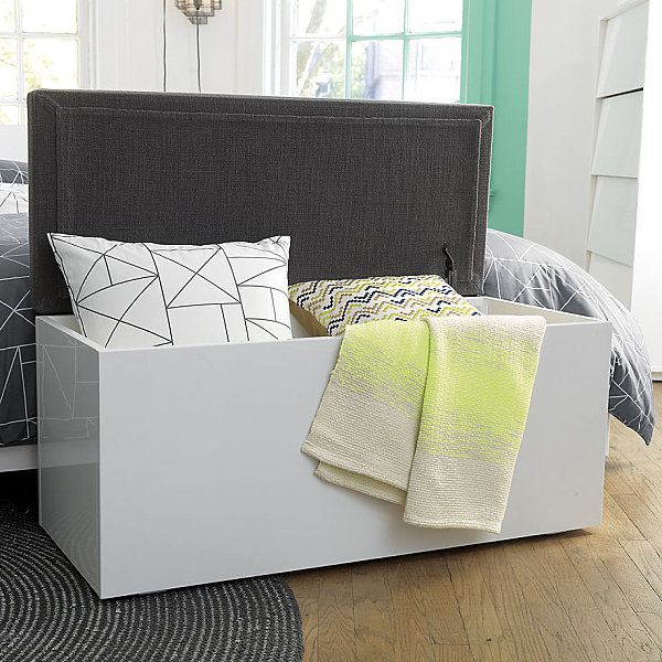
Not to mention, this earthy shade serves as a neutral in spaces like the one below. Note how it adds just the right amount of color while leaving room for other powerful statements, from artwork to the striking geometric rug. [from CB2]

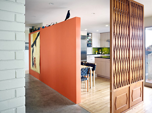
It’s both calming and unforgettable. It’s the perfect backdrop to bright punches of color. It can serve as a stunning neutral. For these reasons and more, I’ve included dusty peach as one of the top colors for 2014! [photo by Bruce Damonte for Nick Noyes Architecture]

Which of today’s featured colors is your favorite for the new year?
Share your thoughts below…